Material Design
Before I could propose new rules for our chips, I needed to learn more about the origin of the component. I started my competitive research by referencing
Material Design 2 and
Material Design 3 documentation on chips.
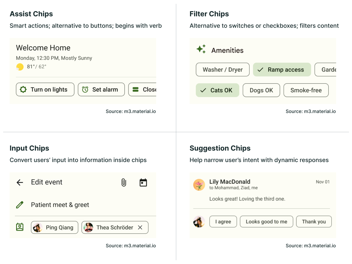
There are 4 types of chips in the latest version of Material Design:
- Assist Chips
- Filter Chips
- Input Chips
- Suggestion Chips
Assist Chips are smart actions, where the text usually begins with a verb. They can be thought of as an alternative to buttons, but the actions are supplemental and contextual to the user’s current task.
Filter Chips, essentially, filter content when they are selected. You can have multiple or single selection filter chips. They can be thought of as an alternative to switches, checkboxes, or multi-selects.
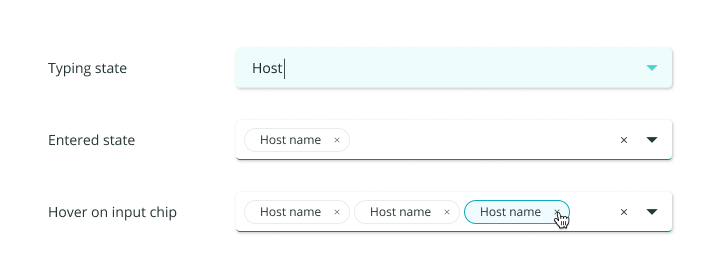
Input Chips nest information that the user has entered in a field, inside a chip. The interaction of text converting into chips happens dynamically as the user types.
Suggestion Chips are somewhat similar to Assist Chips, wherein they provide predictive responses that are contextual to the user’s current task. This is a newly-defined chip type in Material 3.
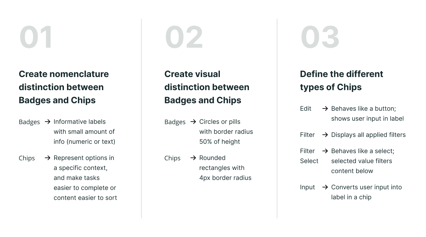
There were a couple of common characteristics in all of these chip types:
- Chips are highly functional. They help users either complete their tasks or find what they're looking for faster.
- Chips appear in multiples. With the exception of Input Chips, where you could have only one input chip, all the other chip types will never present just one option.
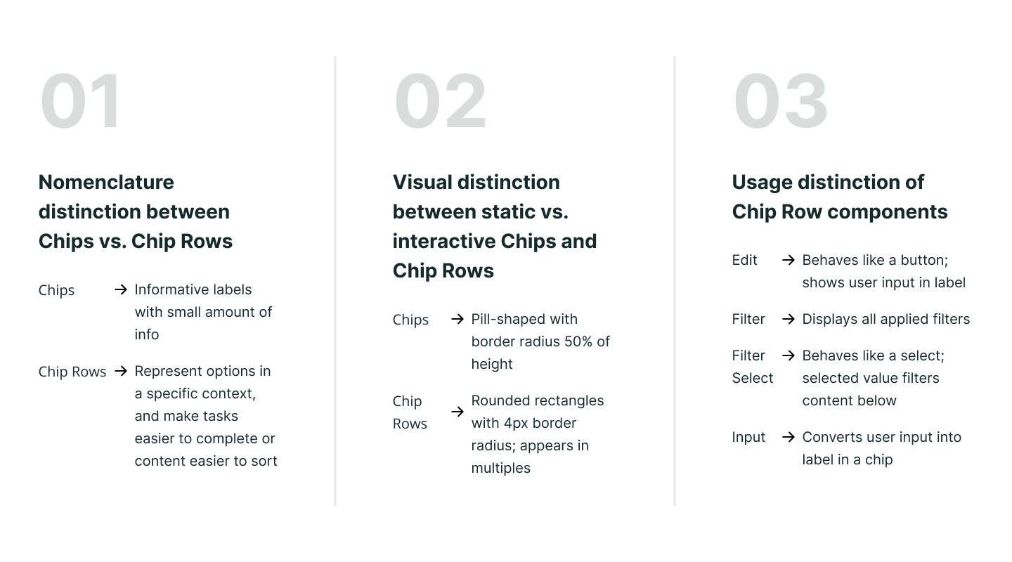
I compared these definitions to the chips in our design system and noticed that the only type of chips that we had in common with Material Design was the Input Chip.
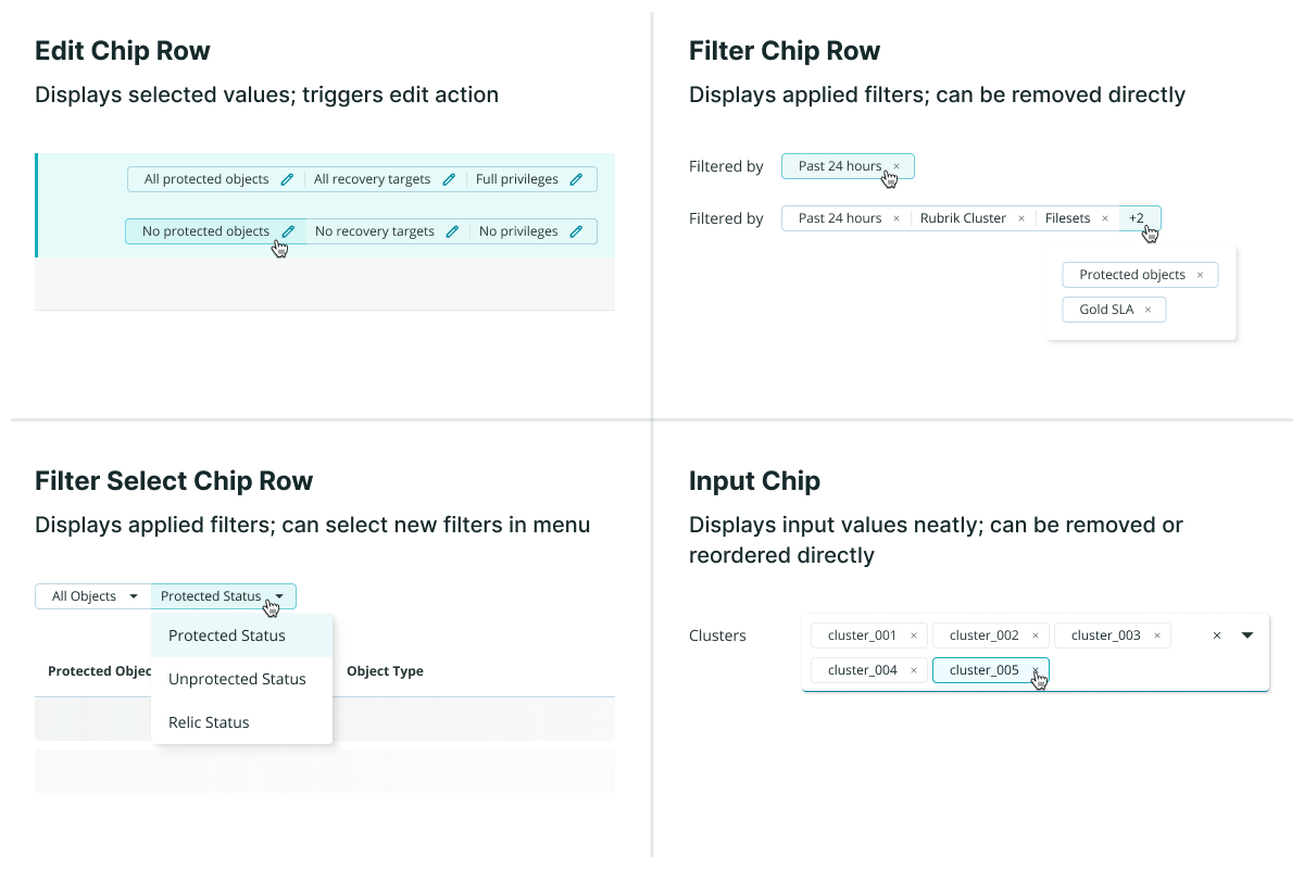
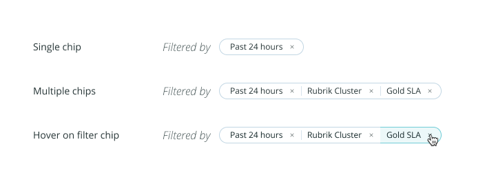
Although we also had a component called Filter Chip, the functionality was different from the one in Material Design. Filter Chips in the Aura Design System displayed the user-selected filters together in a row, rather than allowing the user to apply filters through them. By Material Design’s definitions, they were actually just another form of Input Chips.
Other Design Systems
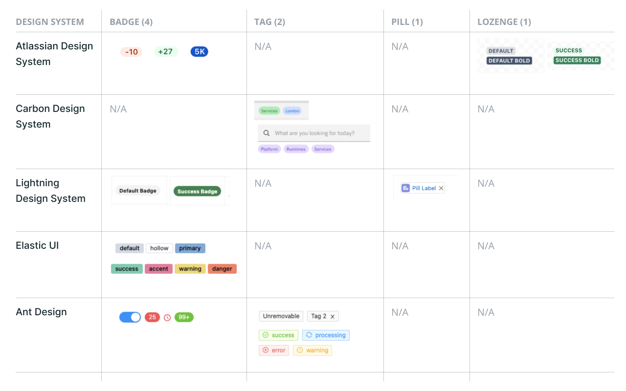
I also looked into other design systems of similar maturity to see how they distinguished different types of chips. The most relevant design systems I referenced were:
- Atlassian Design System (Atlassian)
- Carbon Design System (IBM)
- Lightning Design System (Salesforce)
- Elastic UI (Elastic)
- Ant Design (Ant)
To my surprise, the term chip actually did not show up in most of the component lists. Instead of chips, this type of component had names such as tags, badges, pills, and even lozenges.
I searched online further for any documentation that defined the differences between these terms. It was difficult to find reputable sources that covered this specific topic, but what I found from an assortment of online forums and articles was the following:
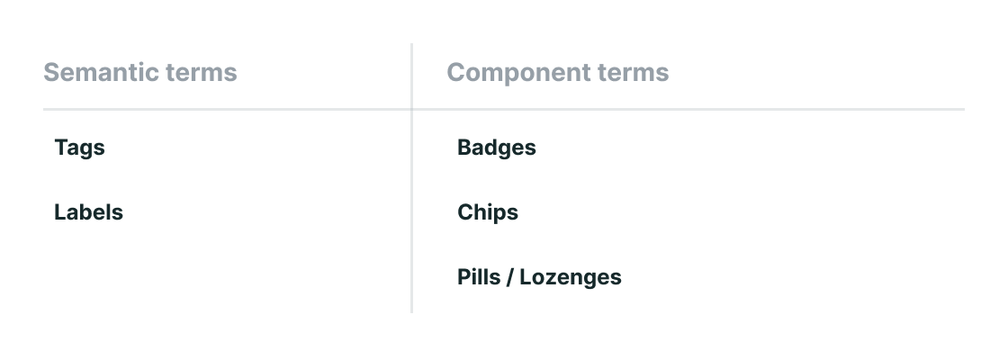
Semantic Terms
Labels
A label is the most generic term for any classification component. In code, a label refers to a HTML tag used in forms for describing what the input is for. Calling another component a label can cause confusion since it's so widely used to describe the text in other components.
Tags
Tags are most known as words or phrases that users can add to content for SEO. It is a general concept about organizing data.
Component Terms
Badges
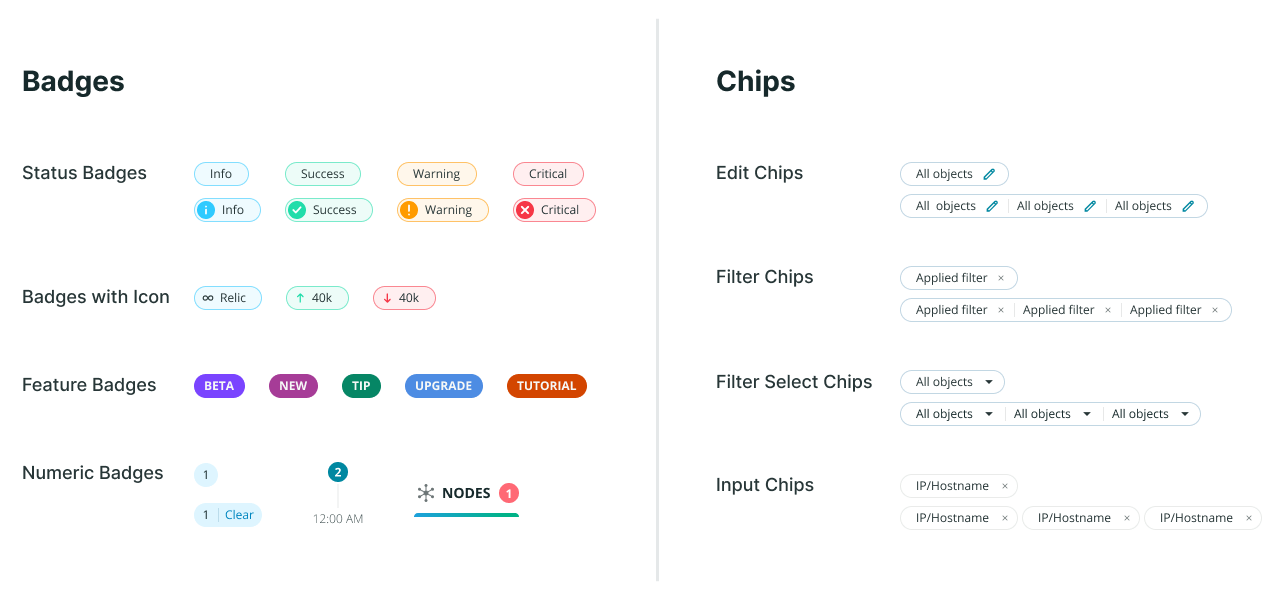
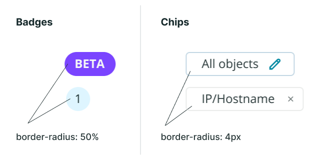
Badges are components holding small amounts of information, often numeric but could also be text. A common example is the app notification counter. They're often thought as a circle, but they don't necessarily have to be.
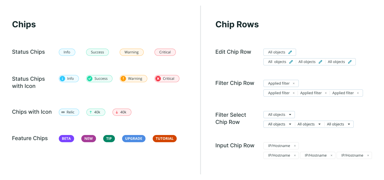
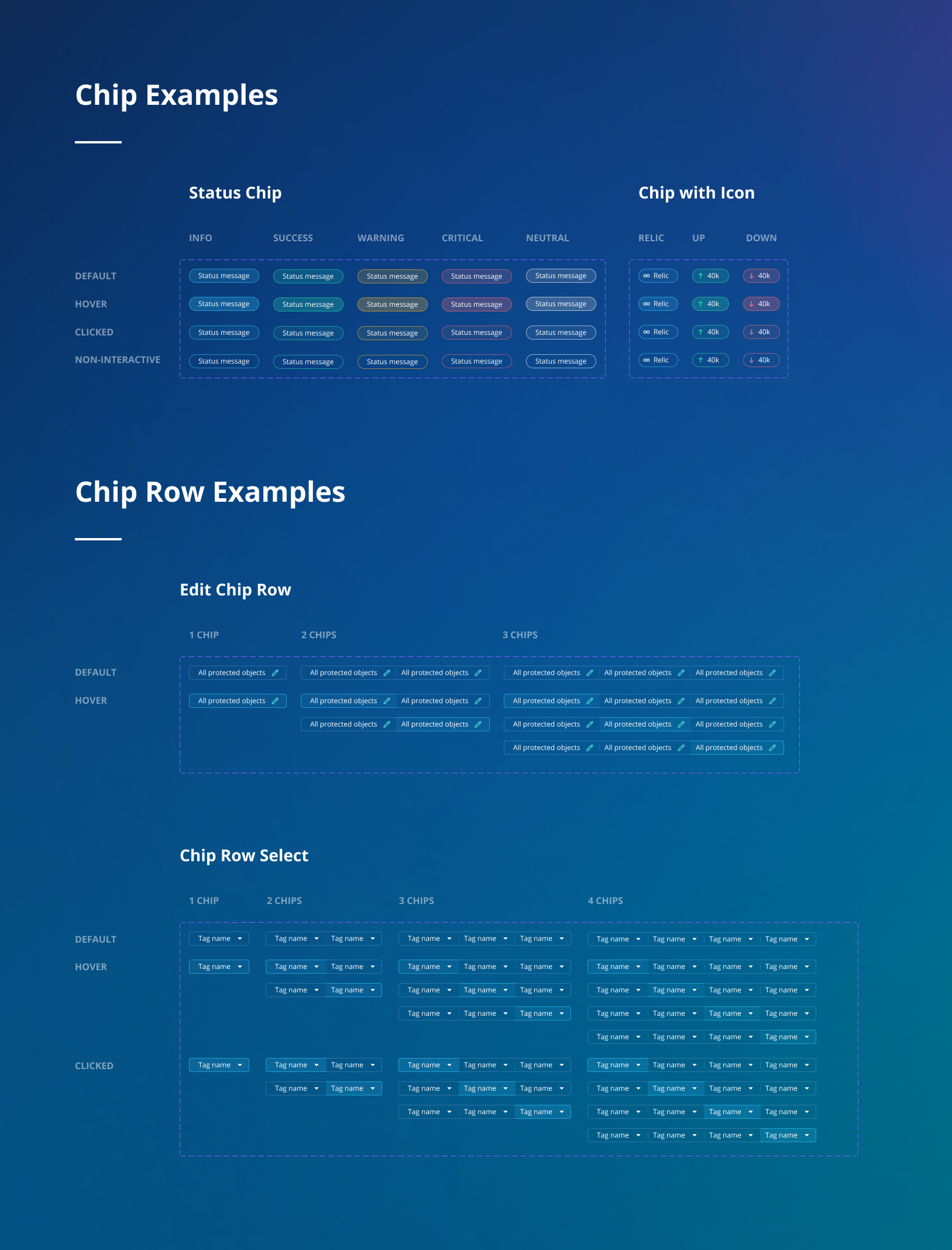
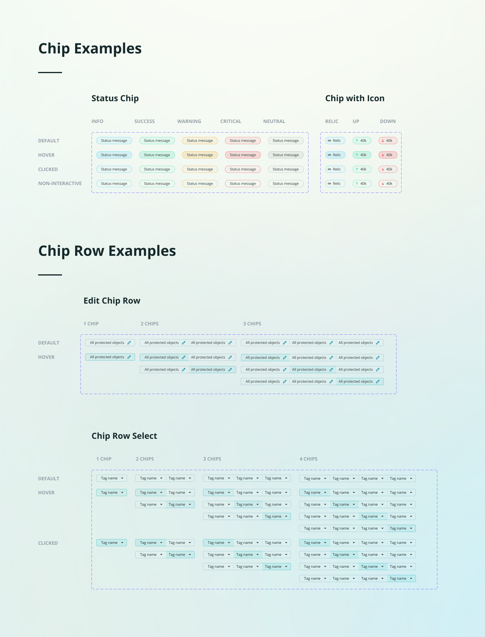
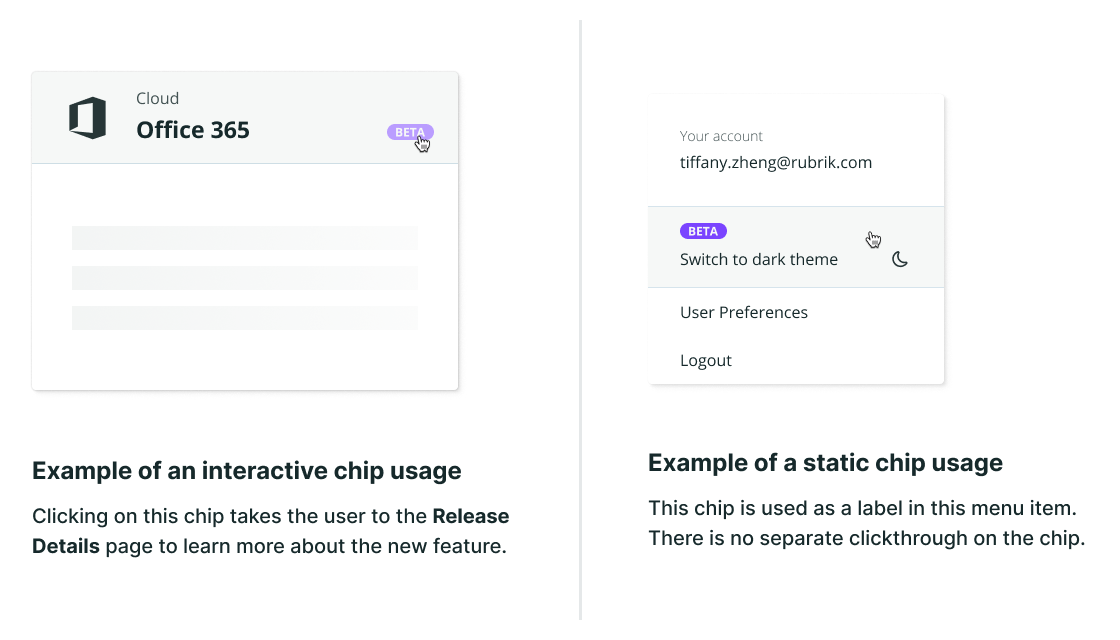
Chips
Chips are used for selecting, filtering, and inputting content. The term was created by Google’s Material Design system.
Pills or Lozenges
The name, pill or lozenge, comes from its shape, rather than functionality. The component doesn’t need to have any border radius to be called this name.
